Home
Bloodlab by German Red Cross
From concept to nationwide rollout
Bloodlab is the software blood-analysis labs run on, and in that world a UX slip isn’t a bug, it’s a safety risk: a missed flag or an unseen detail can put the wrong blood in front of a patient. I spent two years as a designer on this cloud-based LIMS, on software that shipped and iterated continuously. My focus was making the critical things impossible to miss and the routine things fast. On the safety side, I fixed 90% of the accessibility issues so nothing critical could go unseen. On the speed side, I streamlined the workflow doctors live in, making the medical validation process 20% faster. The work directly led to the software being licensed and rolled out across Germany by the German Red Cross, a 0-to-1 platform that went from a blank canvas to nationwide adoption.
Role: Principal Designer, Frontend Developer
Contribution: Product strategy, User experience, Visual design, Frontend development, Design systems
90%
accessibility issues fixed
20%
faster medical validation
2 yrs
on safety-critical software
0→1
to nationwide rollout

01 · THE WEBSITE
Before a lab trusts you with blood, they judge you on the website. I designed the public site to feel as precise and credible as the software behind it, the first signal that Bloodlab was enterprise-ready.
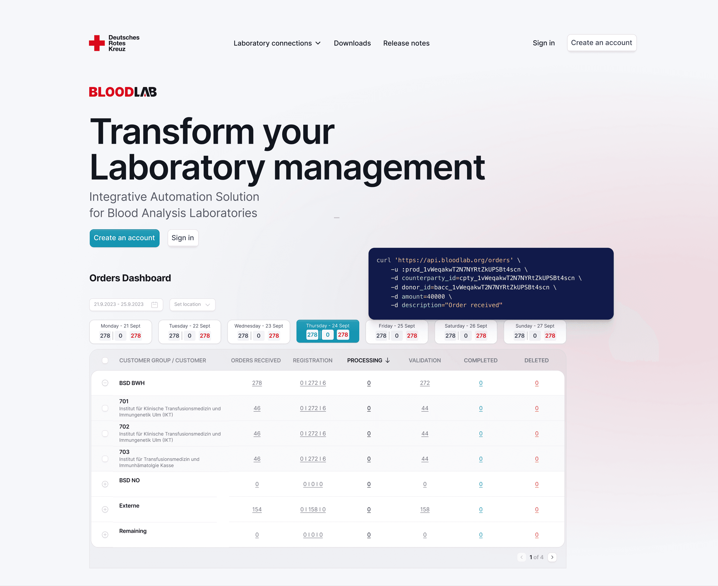
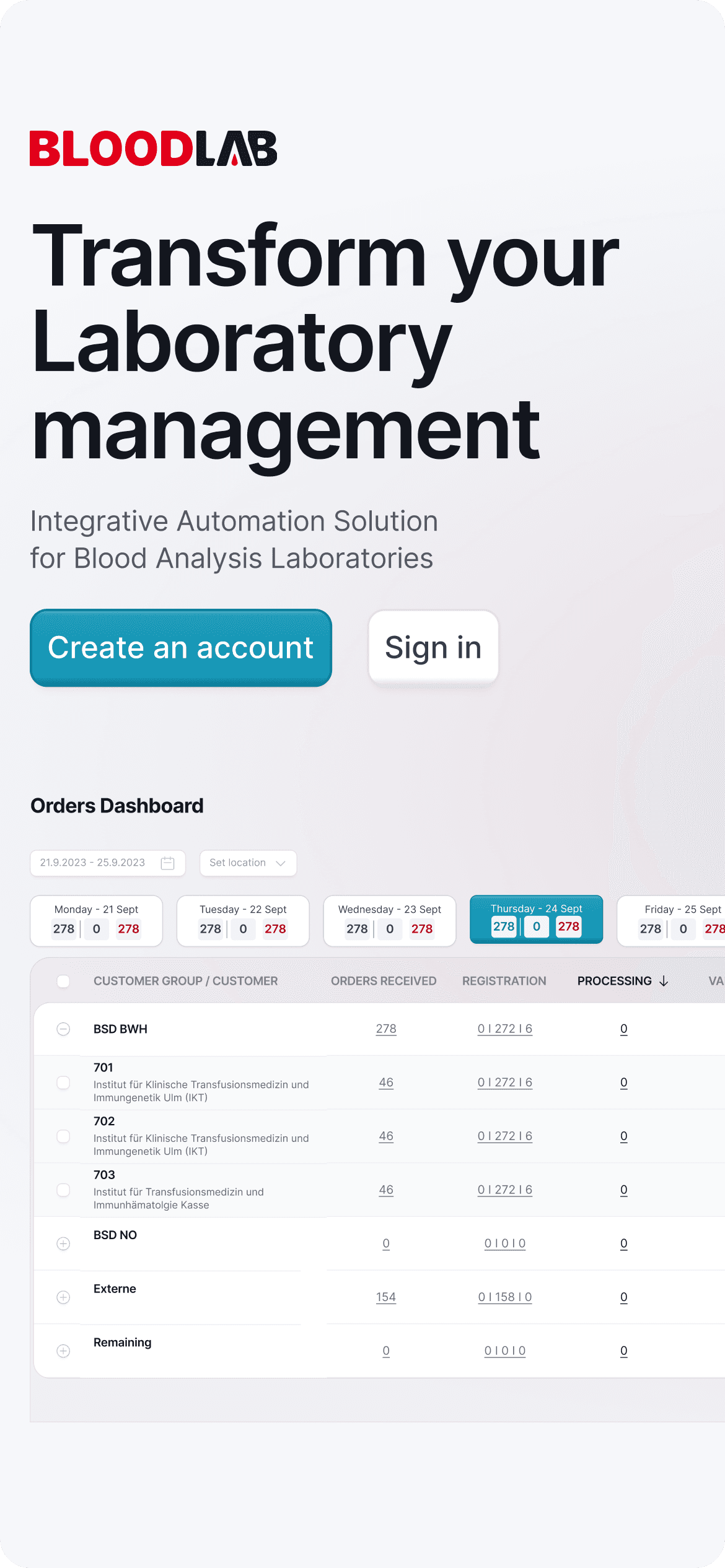
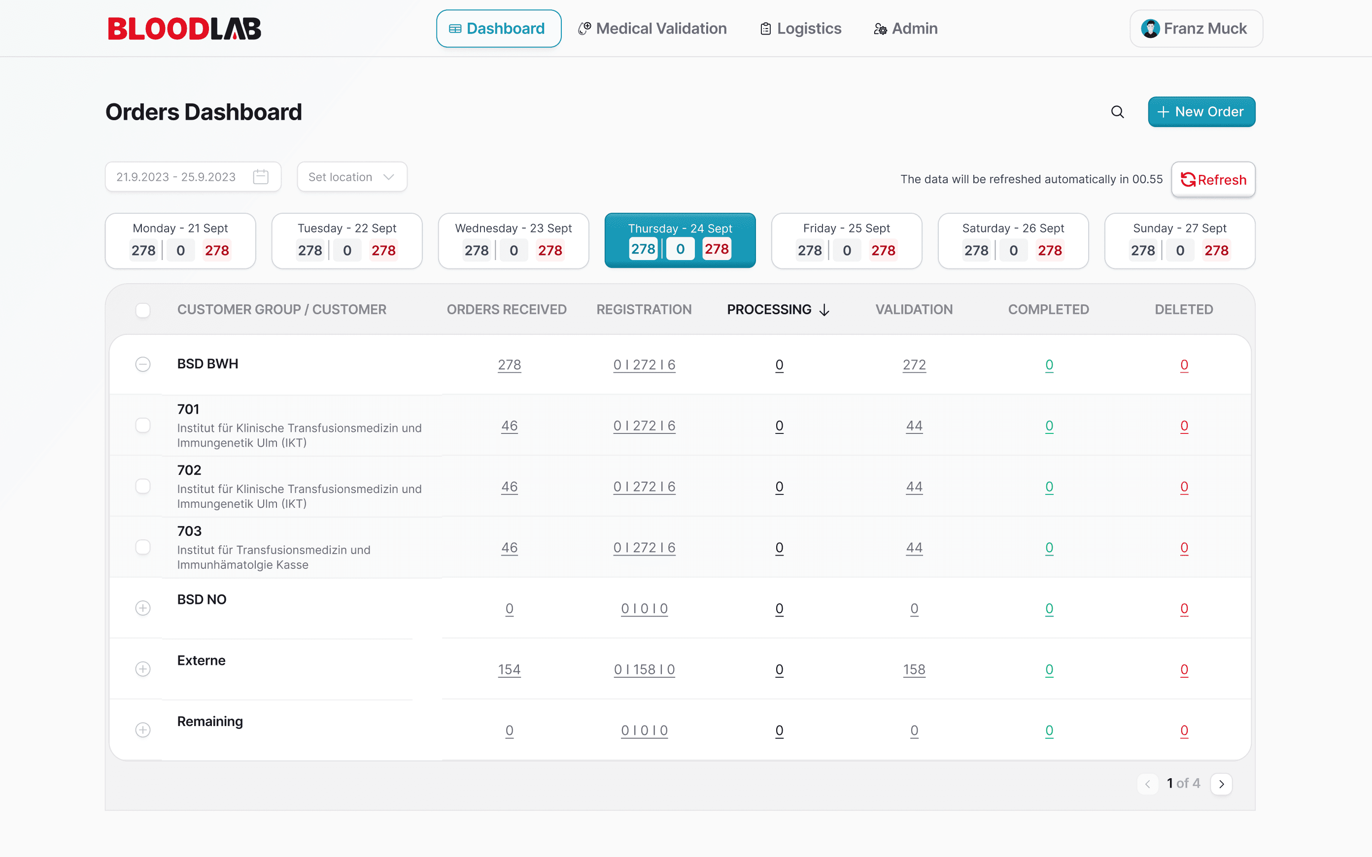
The Orders Dashboard is where a lab’s day starts. I designed it so the state of every order, sample and deadline reads at a glance, dense data kept calm, because in a lab, missing one line has real consequences.
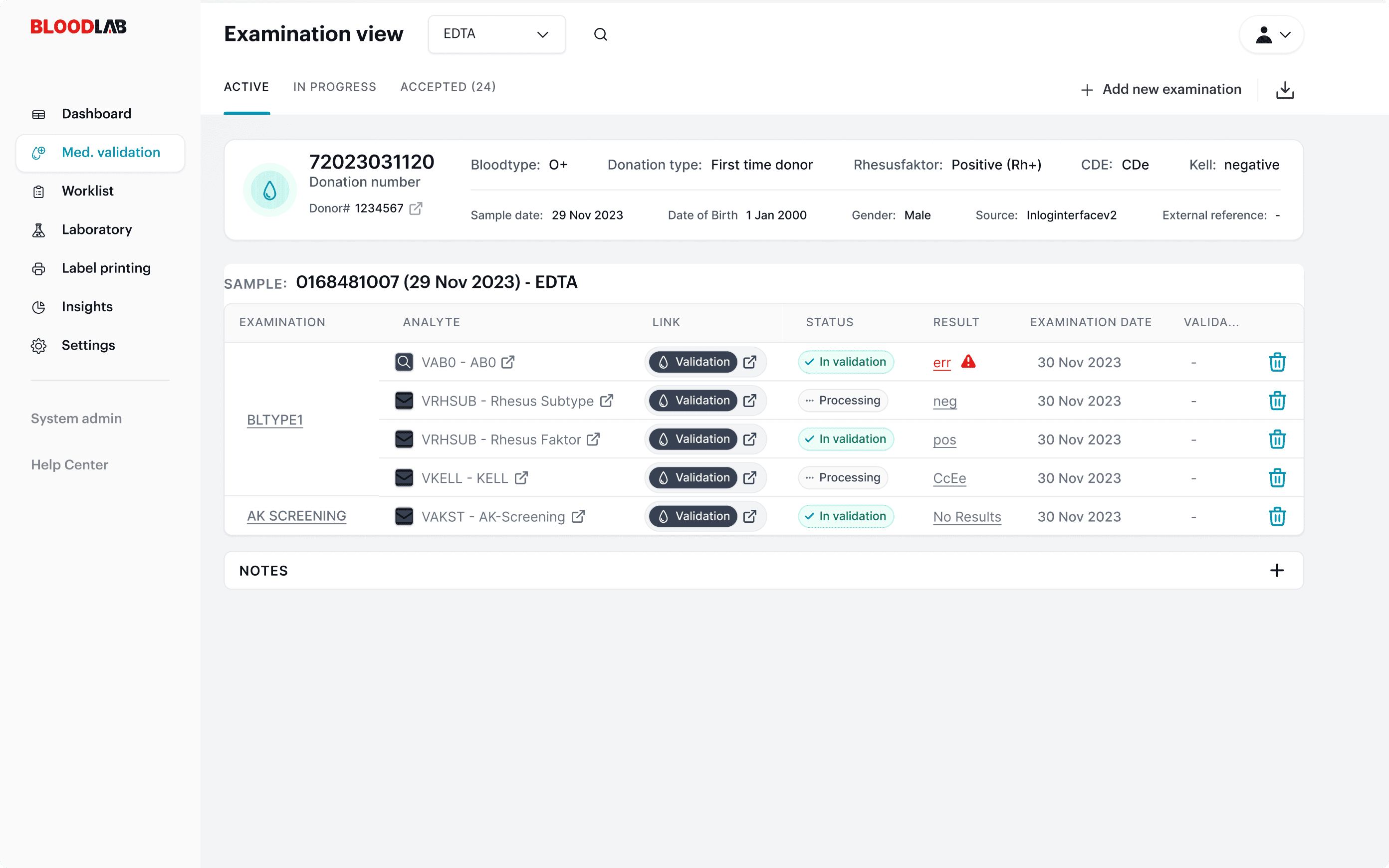
The worklist is where technicians live all day. I optimized it for speed and zero ambiguity: clear status, no hidden actions, and the critical flags impossible to miss, so nothing slips through a busy shift.
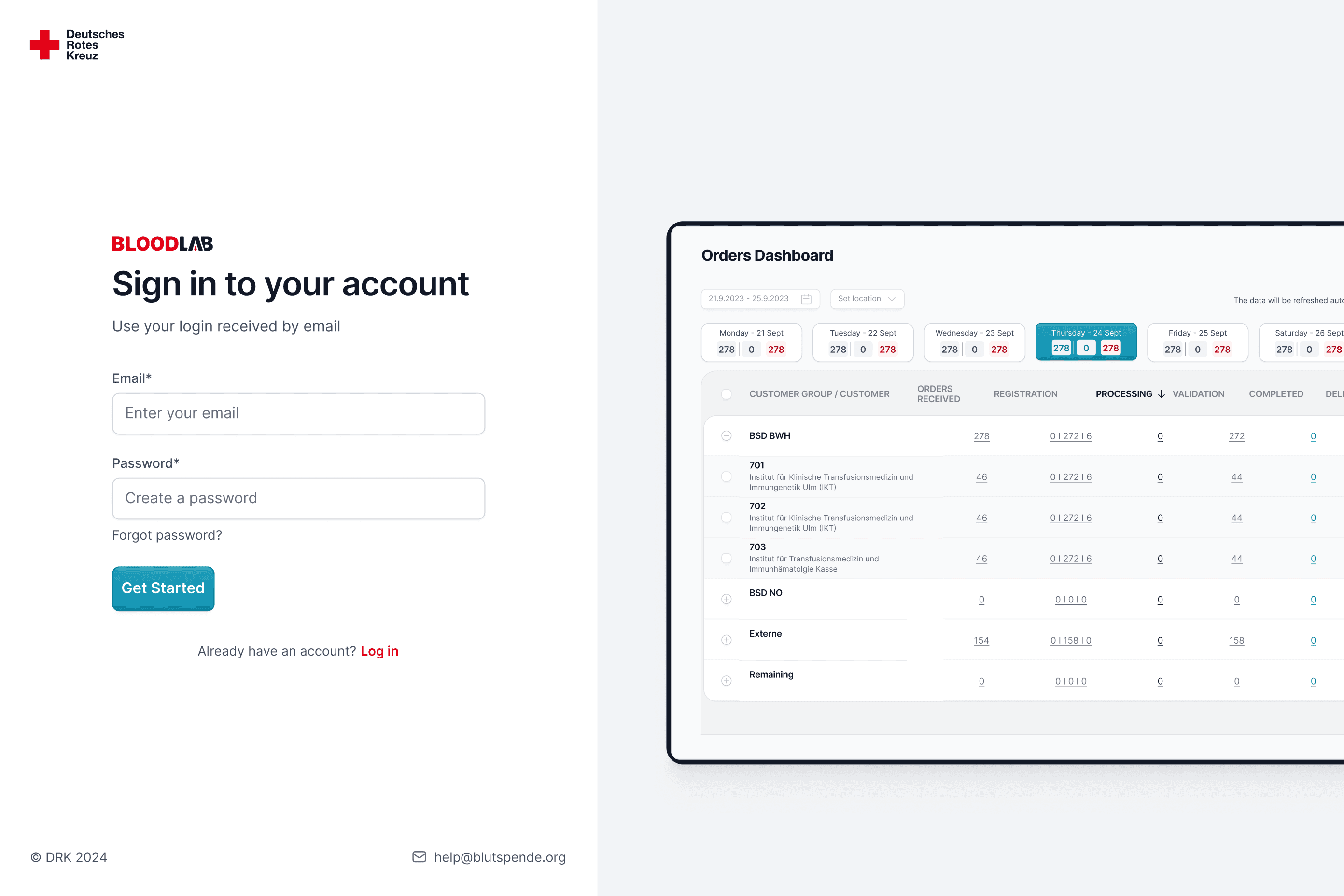
Beyond the pixels: I also built the sign-in flow on the frontend myself and reskinned the Keycloak auth screens, so users met the same craft from the very first login, not something a designer usually ships.
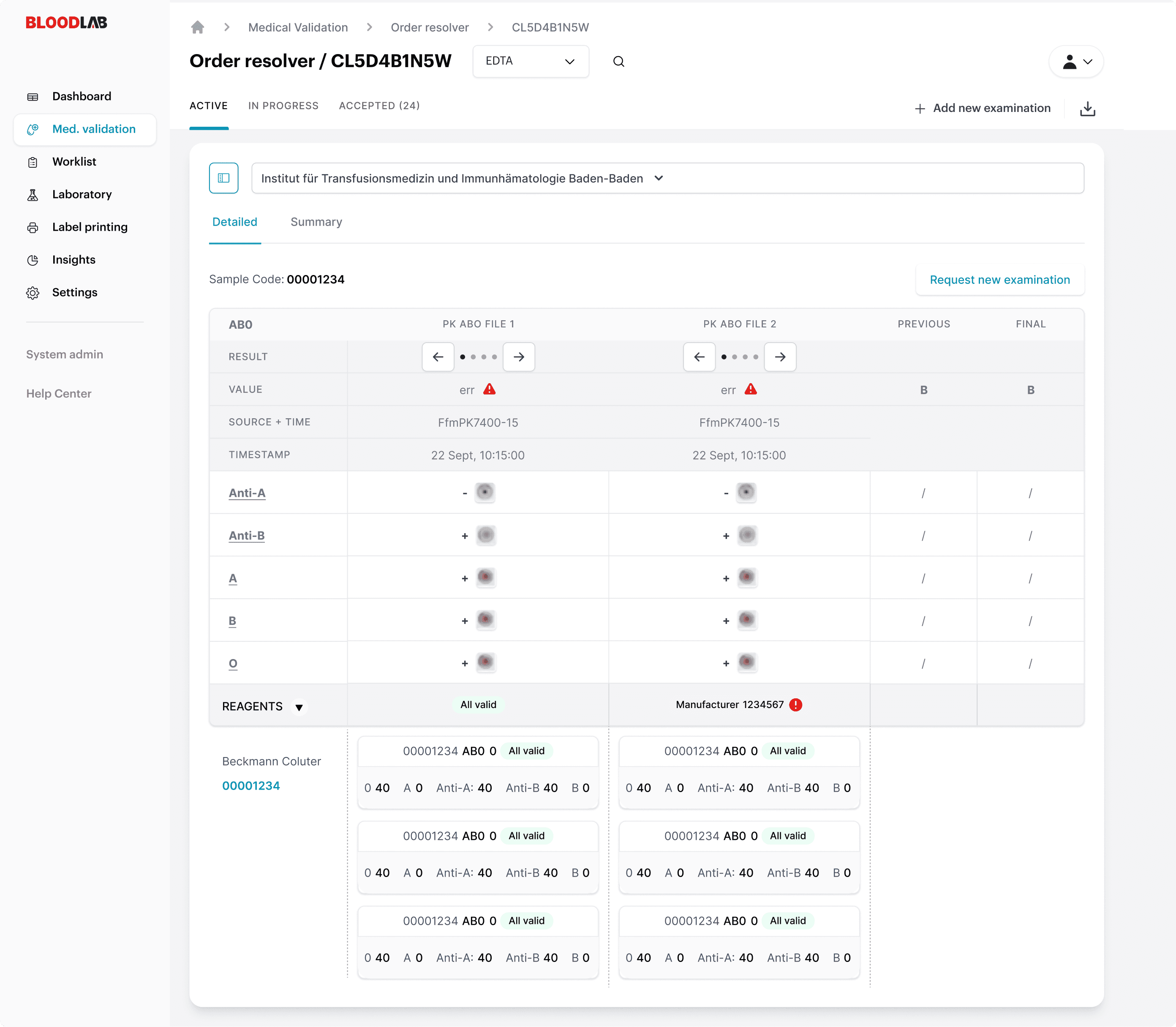
In ABO blood typing, a single misread cell isn't a bug, it's a fatal transfusion, so the design exists to make sure the doctor cannot make a mistake at the one moment that matters most.
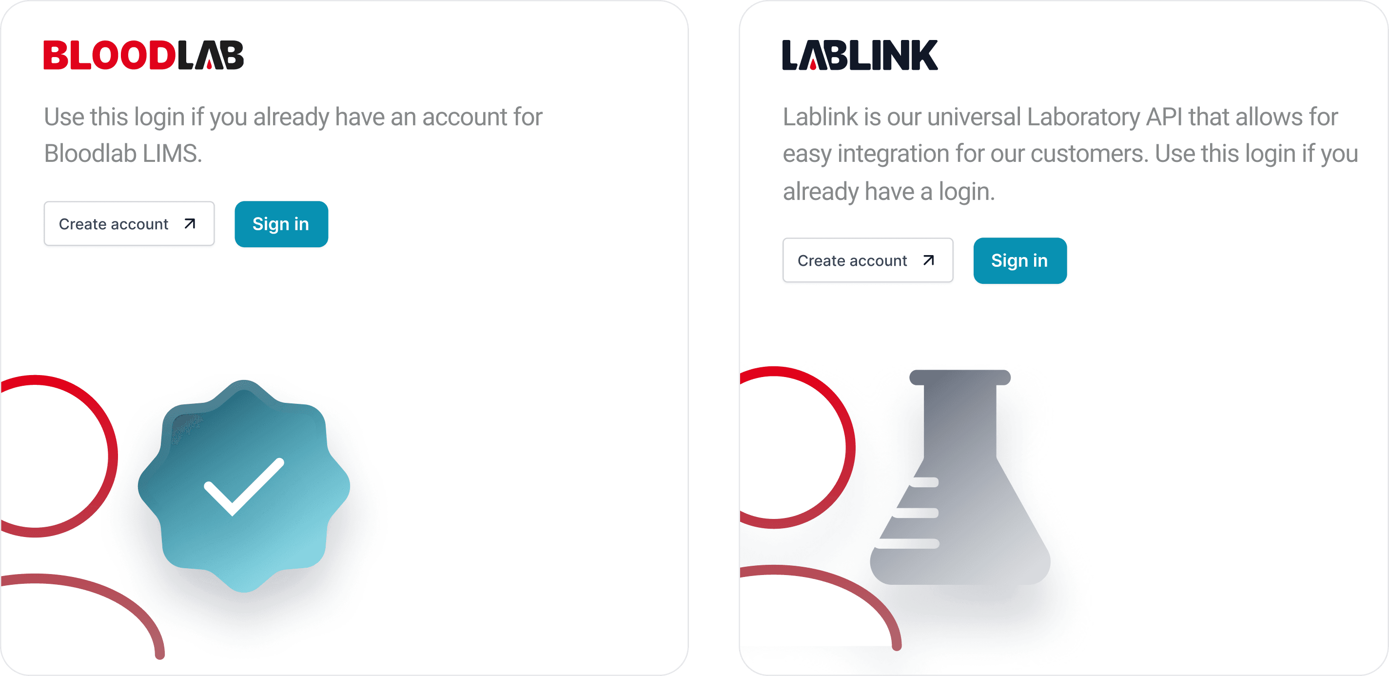
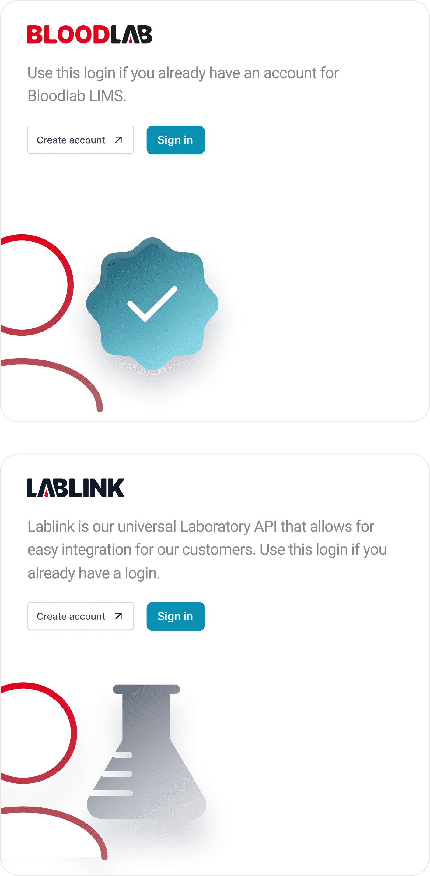
Bloodlab connects to Lablink, so registration had to work across two products without friction. I designed one consistent entry flow, so a lab never feels the seam between the systems.
01 · COLOR SYSTEM
Color here isn’t decoration, it carries meaning. I built a system where red, navy and teal map to status and action consistently, so a technician reads state by color before reading a single word.
DRK Red · Primary
#E2001A
The German Red Cross identity
Navy · Sidebar
#1C2A3A
White
#FFFFFF
Teal · Actions
#0E97B0
Red 500
#FF142F
Red 700
#AD0014
Slate
#6B7280
Cloud
#E5E7EB
Mist
#F3F4F6
Home
German Red Cross, Bloodlab