HOME
From code to care
Four years ago, if a Hungarian parent needed urgent medical information about their child at 2 AM, they’d face a website that looked like it was built in 2005. Navigation was a maze. Mobile? Forget it. And the hospital staff couldn’t even update content themselves without calling a developer.
Today, that same hospital handles 50-60K monthly visits on a website built in Framer—a tool traditionally seen as just for prototyping. This is the story of how we said yes to something most agencies would consider impossible.
PART 1: THE CHALLENGE
Let me paint the picture. Heim Pál Children’s Hospital came to us with a problem that’s familiar to anyone who’s worked in healthcare: their digital front door was broken.
Parents couldn’t find doctors. The appointment system was buried. The site wasn’t responsive—which is a problem when stressed parents are searching on their phones. And here’s the kicker: the hospital team couldn’t update anything themselves. Every tiny change required a developer.
But here’s what made this interesting: they needed this fixed fast, with a limited budget, and they needed to maintain it themselves going forward.
The traditional solution? Hire a dev team, build custom, wait 6-9 months, blow the budget. We chose a different path.
PART 2: HOW WE BECAME FRAMER EXPERTS
Quick story about how ff.next ended up here. We started experimenting with Framer back when it was still primarily a prototyping tool. Playing around, testing limits, seeing what was possible.
Then in 2024, we made a bet: we went all-in. And since then, we’ve delivered over 20 production Framer sites. But here’s what changed for us: Framer works like a design tool—which is why our design team bought in immediately—but it outputs production-ready code. It’s React under the hood.
And look who else is using it in production: Perplexity, Miro, DoorDash, Dribbble, Visual Electric, even SpaceX.
Let me break down why this worked for an enterprise hospital project.
THE LOW-CODE ADVANTAGES
One: SEO that actually works. The code base is recognizable by Google for indexing. Real-time sitemap updates on every publish. For a hospital, discoverability isn’t vanity—it’s critical.
Two: CMS scalability. Custom fields, meta titles, tags, alt text—everything the hospital needs to manage hundreds of pages of content.
Three: Page load speed. Server-side rendering gives you lightning-fast load times. Reliable built-in hosting. Remember, this site handles 50-60K visits monthly with zero performance issues.
Now, the downsides are real—tricky pricing, no code export, no self-hosting. But for this project? The trade-offs made sense.
PART 3: CHALLENGE 1 - INFORMATION ARCHITECTURE
The first real challenge wasn’t design—it was making sense of chaos. The old site had information scattered everywhere. No clear hierarchy. Links pointing to nowhere.
We started with a content audit. Then we identified the core user journeys. Here’s what we learned: Parents coming to this site have three main needs.
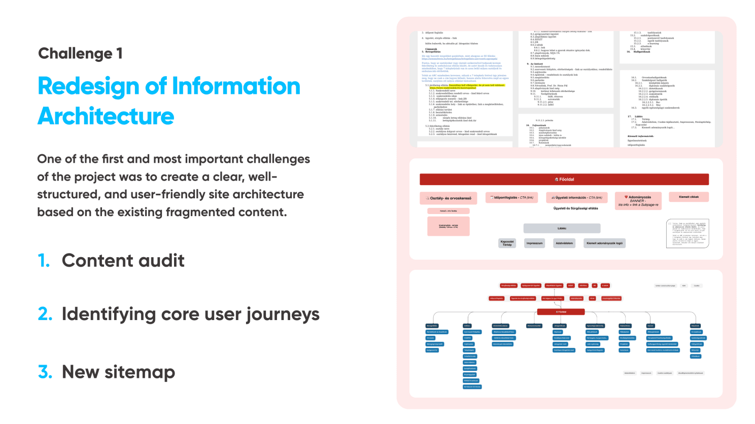
One: “Is this an emergency, and what do I do?”
Two: “I need to find a specific doctor or department.”
Three: “I need practical information—visiting hours, parking, how to prepare my child.”
We created a sitemap that puts these three needs front and center. Everything else—PR, professional content, documents—gets organized but doesn’t compete for attention.
The result? Maximum three clicks to any critical information. Compare that to the old site where you might dig through seven layers to find a phone number.
PART 4: CHALLENGE 2 - DESIGN THAT CALMS (2.5 minutes)
Here’s the human challenge: How do you design for parents in crisis? This isn’t e-commerce where you want excitement. This isn’t social media where you want engagement. This is a parent whose child is sick, possibly scared, definitely stressed.
We explored two directions—one more playful with illustrations and bright colors, very kid-friendly. The other was cleaner—flat design, pastel palette, structured.
We went with calming. Here’s why: parents need reassurance and clarity, not stimulation. Children might enjoy playful, but the decision-makers are adults in stressful situations.
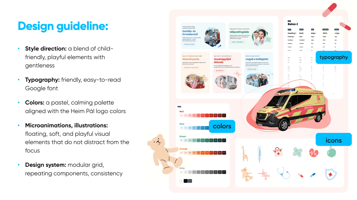
Our palette is soft—pastels derived from the hospital’s existing brand. Typography is ultra-readable—Google Fonts for accessibility. And we added these gentle floating illustrations and micro-animations that suggest care without being childish or distracting.
PART 5: CHALLENGE 3 - SCALE AND SPEED
Now for the technical bit. This hospital needed hundreds of pages: doctor profiles, department pages, news articles, events, documents. In a traditional build, that’s weeks of development time for templates and CMS integration.
In Framer? We built it in weeks, not months. Here’s how:
First, modular design system. Every component—doctor cards, department headers, news blocks—built once, reused everywhere.
Second, CMS collections. We structured everything: doctors, departments, news, events. The hospital staff can now add a new doctor in five minutes. No code required.
That’s it. No developer. No deploy process. Just publish.
Third, smart filtering. Parents can search by department, by doctor name, by location—all powered by Framer’s built-in features.
PART 6: WHAT DESIGNERS LEARN
Here’s what’s really interesting about this journey: Framer teaches you to think like a developer without losing your design sensibility. You start learning React patterns without realizing it. You’re thinking about component architecture, state management, performance optimization—all while working visually.
And when you do hit a wall? You can drop in custom React code. You can leverage hundreds of thousands of React libraries where people have already solved these problems. You don’t have to reinvent the wheel.
Think about running shoes. You can buy the same carbon-plated Nike Alphafly 3 that elite marathoners wear. Does that make you a better runner? No. A beginner in advanced shoes is still a beginner.
But if you’ve put in the training—if you understand pacing, form, technique—then that shoe becomes a weapon. It amplifies what you already know how to do. Framer is the same. The tool got better, absolutely. But it doesn’t make you a better designer.
But here’s what’s exciting: You can own the entire website process. From strategy to design to development to deployment. No handoffs. No translation loss. No waiting. You become unstoppable. You can take projects from idea to live site in ways that were impossible just a few years ago. That’s the opportunity.
And that’s why this is such an exciting time to be a designer.
PART 7: WHERE ARE WE HEADING?
Here’s where I think we’re heading: Designers will increasingly own website creation end-to-end. Developers will focus on the heavy lifting—complex applications, custom functionality, systems integration, the hard problems that actually need engineering.
We can now say yes to projects even with tight budgets and timelines. We can move from workshop to live site in weeks. Small teams can do what used to require dev agencies.
And most importantly—we can give clients like Heim Pál the ability to own their content, update in real-time, and serve their community better.
This isn’t about tools getting better. It’s about designers becoming builders—and that changes everything.
My talk at the UX Budapest Meetup
Huge kudos to everyone involved in the project from ff. next : Kata Vaszlovics , @jennifer gindele, Richard Vajda , Ivan Muck and Barion Balazs Judik .
And many thanks for the UX Budapest Meetup organizers to include this talk on their previous event: Anna Vásárhelyi , Judit Pónya , Alex Pócsi
More